One of the questions I hear most often is, “Can my rooms be different from each other, or does everything have to match?” My answer is always the same: your rooms should absolutely have their own personalities. They just need to speak the same language.
PITTSFORD, NEW YORK
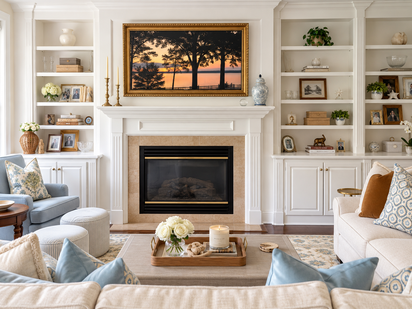
This Pittsford home is one of my favorite examples. The family room is bright, soft and easy, while the sitting room just through the doorway is deep, rich and moody. On paper, they’re opposites. In person, they feel like they were always meant to be together. Here’s how we got there.
1. Give each room a job
Before choosing a single fabric, we talked about how the family actually lives. The family room needed to handle everything: movie nights, kids, guests, long evenings by the fire. The sitting room was for slower moments: reading, conversation and the piano.
Once each room had a clear purpose, its mood followed naturally. Everyday living called for light and comfort. A room for lingering could be cozy and dramatic.
2. Choose one shared palette, then turn the volume up or down
The secret to connected rooms is a common thread. Here it’s blue, cream and warm wood.
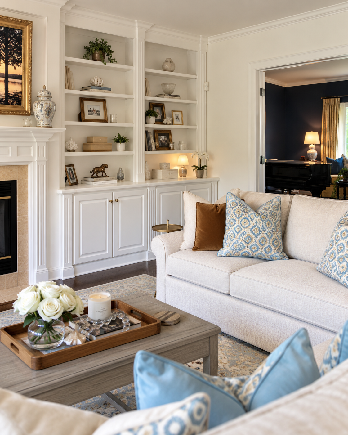
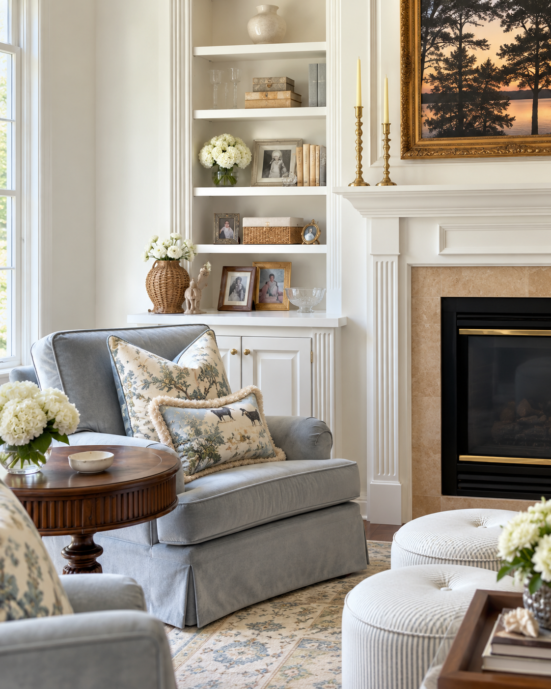
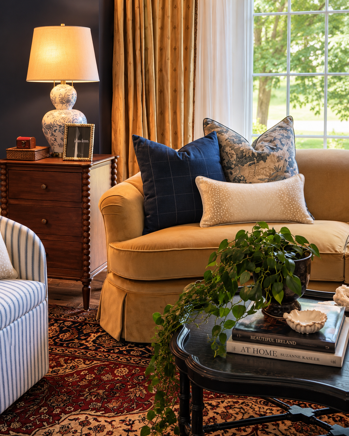
In the family room we kept the volume low: cream upholstery, soft blue chairs, crisp white built-ins and pale pattern. In the sitting room we turned it all the way up: navy walls, a mustard velvet sofa, gold drapery and a rich Persian rug.
Same family of colors, completely different feeling.
3. Let one element travel between the rooms
Blue-and-white porcelain shows up in both spaces: ginger jars on the family room mantel and shelves, and a beautiful porcelain lamp in the sitting room. When you stand in the doorway and see both rooms at once, that repeated element tells your eye these rooms belong to the same story.
Pick one thing (a material, a pattern, a metal) and let it appear in every room it can see.
4. Layer pattern with intention
Both rooms are full of pattern, but it never feels busy. My rule is to mix scales and keep the colors related.
In the family room, a toile pillow sits with a smaller-scale print, a ticking stripe on the ottomans and a soft medallion rug. In the sitting room, a windowpane check, a blue floral and a speckled lumbar pillow layer over a traditional Persian rug.
Large, medium and small, all pulled from the same palette.
5. Style the built-ins like a story, not a store
Built-ins can make or break a room. We filled these with a collected mix of family photos, books, brass, woven baskets, coral and porcelain, with plenty of breathing room left on every shelf.
The goal is for shelves to look like they were gathered over years, not bought in one afternoon. Personal pieces (especially family photos in mismatched frames) are what make a room feel like your home.
6. Don’t be afraid of a dark room
Navy walls can feel intimidating, but a dark color in a smaller room creates instant intimacy. Paired with warm lamplight, gold drapery and natural light pouring in through the window, this sitting room feels enveloping rather than heavy.
If you’ve been curious about a moody color, a sitting room, study or powder room is the perfect place to try it.
The takeaway
Your rooms don’t have to match. They just need to connect. Give each room a purpose, share a palette, let one element travel, and layer pattern thoughtfully. The result is a home that feels collected, personal and completely cohesive, from one doorway to the next.
See the full project, The Pittsford Classic, in Selected Work. Dreaming about your own home? Let’s talk. That’s the alchemy.
